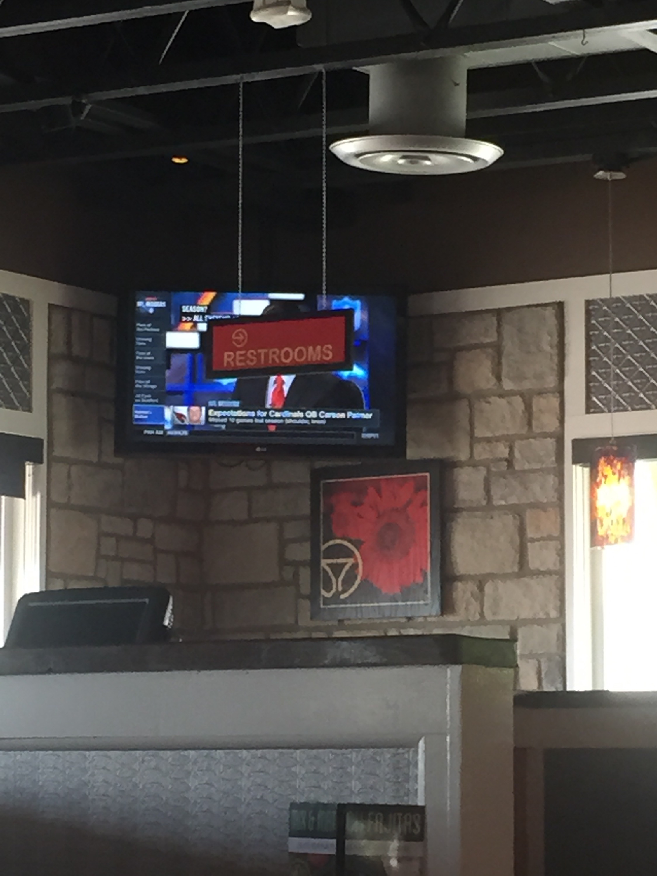
My wife and I took our kids to Chili’s the other day for lunch. We sat down and glanced up at the TV that was in my line of sight. This was my view:

The restroom sign effectively blocking the television screen for nearly everybody for whom that screen is in their direct line of sight.
I snapped a picture of it for some social media chuckles, but the more I’ve thought about it, there’s a lesson in design and product strategy. It reveals a simple truth that there really is no best practice, only better practices that should be validated against the needs of your strategy.
Context is Everything
Let’s go back to that Chili’s dining area. There are two patterns that by themselves are good ideas. Pattern #1: By putting the TV in the corner of the restaurant, the maximum viewing angle is achieved. Pattern #2: By placing the sign at the end of the store in a visible location, such as the end of a row, users can quickly confirm they are heading the right direction towards the bathroom.
In this case only one of the patterns is severely impacted for a vast majority of the consuming audience. Only peripheral users could visually access the full television viewing experience.
Before you adopt a best practice, make sure to validate it through user research and/or A-B testing: make sure it makes sense in your rhetorical situation.