Stats & Process:
Clarke Building Parking Lot, BYU-Idaho Campus, Rexburg, Idaho; May 5, 2011 7:28 p.m. F/2.8 SHUTTER: 1/400; Exposure Compensation: -1.33 ISO 100 Canon Powershot SX 120 IS
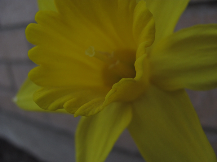
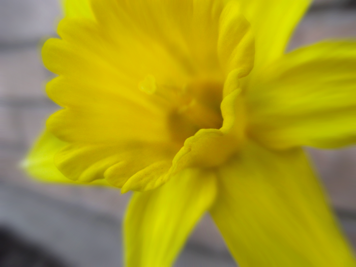
These flowers were in the shadow but with normal light, even at 7 p.m. they were washing out because of their natural vibrancy. I set the exposure compensation deliberately low to bring back the saturation and so forth in post production. In post production, I first used a levels and saturation adjustments bring back the bright yellow in the flowers. After that, I used a smart filter to create a motion blur on the flower. Instead of a radial blur I chose a more direct on blur, giving the sense of rushing the flower. With a mask I enlarged the center to include the entire bell of the flower. To finish up, I returned to the saturation adjustment and with a mask desaturated some of the areas of shadow on the flower, strengthening contrast and fidelity.
Stats & Process:
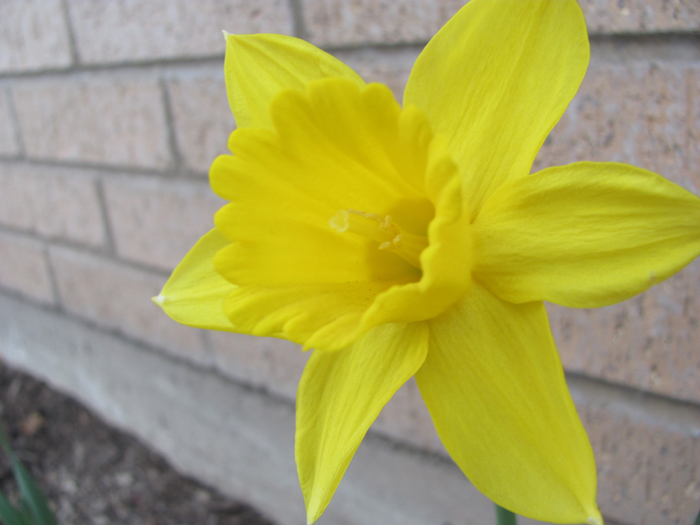
Clarke Building Parking Lot, BYU-Idaho Campus, Rexburg, Idaho; May 5, 2011 7:27 p.m. F/2.8 SHUTTER: 1/125; ISO 100 Canon Powershot SX 120 IS
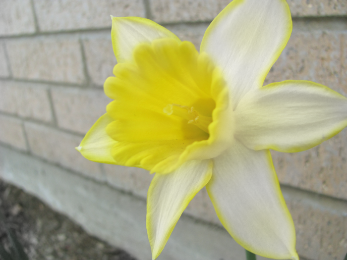
Using purely adjustment layers, I created this more artistically oriented piece. I first used a black and white “yellow filter” adjustment layer. This created a higher contrast between the flower and the surrounding. I then began to mask back in all of the background brick and I deliberately tinged the edges of the flower. For a final touch, I added back in the yellow in the bell of the flower. The whole artisitic idea behind it was to create the feeling of the flower generating its own light and warmth to share with the world around it.


I love what you did with the daffodill!!!! I absolutely love it. So creative, i never would have thought about doing that. The blurred image. I wasn’t sure but is that before or after you editted. It would be cool if the whole flower was in focus or at least something on the flower was in focus like a bug or something.
Thanks for your comments Lacey.
The blur was intentional: I was experimenting with the motion blur. In my mind I was going for a sort of rush towards the flower feel. I like the idea of having something to focus on: I really like the ladybug idea. When I went back to look at that picture on the computer screens in the lab, I realized the yellow was much brighter than my laptop let on–which was cool, but having something (like a ladybug) to focus on would have been a very nice touch to offset that.
I like how to you lightened the flower but kept the the edge the original color. Adding the black and white filter really makes the flower pop.